Pass/Fail Over Time
The Pass/Fail Over Time report provides a visualized count of passes and fails. Changing the date range allows for viewing how the environment has evolved over time.
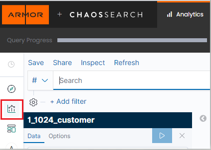
In Nexus, go to the Log Search tab located at the Log Search screen under Threat Management.
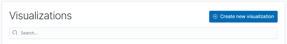
Click on Visualizations.
Click the Create new visualization button.
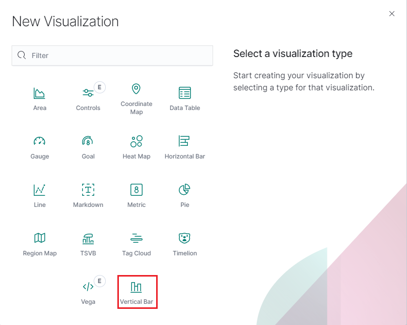
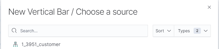
In the New Visualization pop up, select the Vertical Bar visualization option.
Choose a source.
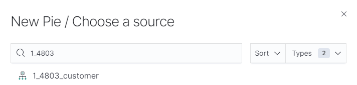
In sources select <PARTNER_ACCT_ID>_<CUSTOMER_ACCT>_customer.
Partner accountId may be 1 or another number. Select the source matching the account number in the top right corner of the page or listed on the Account page followed by "_customer".
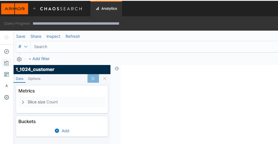
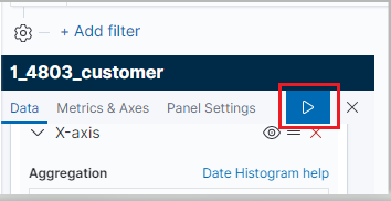
Log Search will refresh to display the query screen. From here, the visualization can be configured.
Click Add Filter.
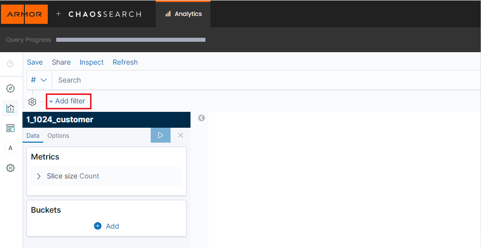
Type in "event.ReportId" into the Field box.
Select the Operator "is".
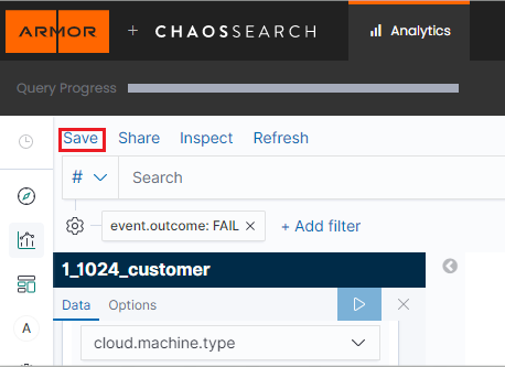
In the Value box, paste in the reportId.
Click the Save button.
Under Metrics this should already be set to Y-axis Count. No change is needed.
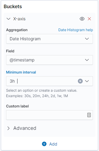
Two buckets are needed to configure this visualization. Under Buckets, click the Add button, making sure to select X-axis.
In the Aggregation drop down, select Date Histogram.
In the Field box, enter "@timestamp" or search for it.
Leave Minimum interval at Auto.
Order by, Order and Size should all remain with their default values. Properly configured, the first bucket will look like the screenshot below:
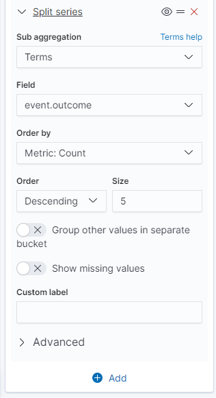
To add the second bucket, click the Add button underneath Buckets, making sure to select split series.
In the Sub aggregation dropdown, select Terms.
In the Field, enter "event.outcome" and select it.
Order by, Order and Size will be set to default. Properly configured, the second bucket will look like the screenshot below:
When both buckets are configured, click the Apply Changes button.
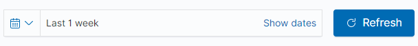
Set the date range for the visualization.
If the range encompasses more than one report, an additional filter with the report id can be added to narrow down the results if desired.
Save the visualization by clicking Save in the top left of the screen.
Users can view previous visualizations by clicking Visualizations and selecting the desired visualization from the list.