Standard Visualizations
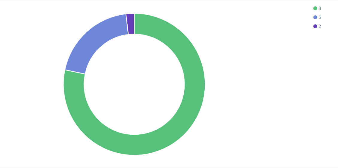
Vulnerability Distribution by Severity
The Vulnerability Distribution by Severity report will show you the vulnerability by a severity number
In AMP, go to the?Log Search?screen.
Click on?Visualizations.
Click the?Create new visualization?button.
In the New Visualization pop up, select the?Pie Chart?visualization option.
Choose a source.
In sources select <PARTNER_ACCT_ID>_<CUSTOMER_ACCT>_customer.
Partner accountId may be 1 or another number. Select the source matching the account number in the top right corner of the AMP page or listed on the Account page followed by "_customer".
Log Search will refresh to display the query screen. From here, the visualization can be configured.
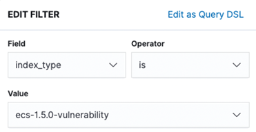
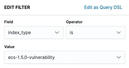
One filter will be applied to this visualization:
Click on Add filter
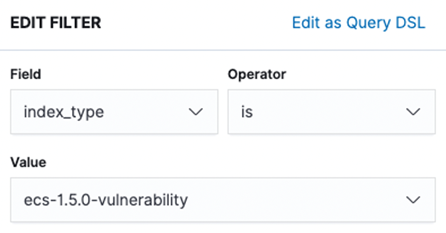
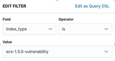
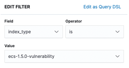
Set the filter up as seen below. You will have to manually type in "ecs-1.5.0-vulnerability in the Value field and click Save
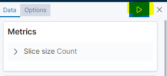
Under metrics this should already be set to Y-axis Count. No change is needed.
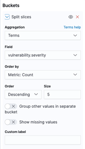
One bucket is needed to configure this visualization. Under Buckets, click the?Add?button, making sure to select?Split Slices.
In the Aggregation drop down, select?Terms.
In the?Field?box, enter "vulnerability.severity" or search for it.
Order by, Order and Size should all remain with their default values. Properly configured, the bucket configuration will look like the screenshot below:
When the bucket is configured, click the?Apply Changes?button.
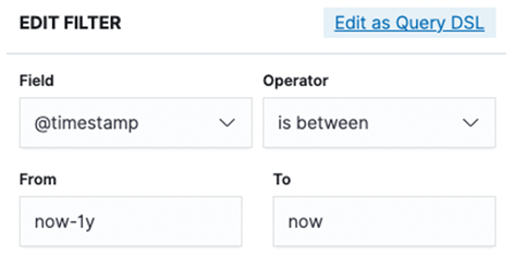
Set the date range for the visualization.
If the range encompasses more than one report, an additional filter with the report id can be added to narrow down the results if desired.
Save the visualization by clicking?Save?in the top left of the screen.
Users can view previous visualizations by clicking?Visualizations?and selecting the desired visualization from the list.
Vulnerability by Host
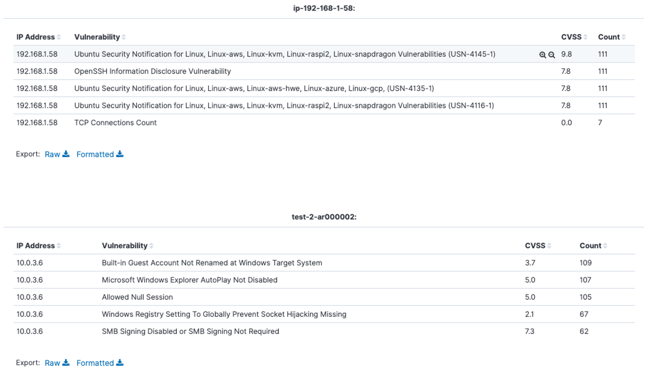
The Vulnerability by Host report will show you the top vulnerabilities by hostname
In AMP, go to the Log Search screen.
Click on Visualizations.
Click the Create new visualization button.
In the New Visualization pop up, select the Data Table visualization option.
Choose a source.
In sources select <PARTNER_ACCT_ID>_<CUSTOMER_ACCT>_customer.
Partner accountId may be 1 or another number. Select the source matching the account number in the top right corner of the AMP page or listed on the Account page followed by "_customer".
Log Search will refresh to display the query screen. From here, the visualization can be configured.
One filter will be applied to this visualization:
Click on Add filter
Set the filter up as seen below. You will have to manually type in "ecs-1.5.0-vulnerability in the Value field and click Save

Under metrics this should already be set to Y-axis Count. No change is needed.
4 buckets are needed to configure this visualization.
Bucket configuration for Bucket 1
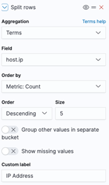
Under Buckets, click the Add button, and select Split Rows.
In the Aggregation drop down, select Terms.
In the Field box, enter "host.ip" or search for it.
Order by, Order and Size should all remain with their default values. Properly configured, the first bucket configuration will look like the screenshot below:
Bucket configuration for Bucket 2
Under Buckets, click the Add button, and select Split Rows.
In the Aggregation drop down, select Terms.
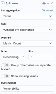
In the Field box, enter "vulnerability.description" or search for it.
Order by, Order and Size should all remain with their default values. Properly configured, the second bucket configuration will look like the screenshot below:
Bucket configuration for Bucket 3
Under Buckets, click the Add button, and select Split table.
In the Aggregation drop down, select Terms.
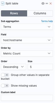
In the Field box, enter "host.hostname" or search for it.
Order by, Order and Size should all remain with their default values. Properly configured, the third bucket configuration will look like the screenshot below:
Bucket configuration for Bucket 4
Under Buckets, click the Add button, and select Split rows.
In the Aggregation drop down, select Terms.
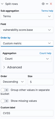
In the Field box, enter "vulnerability.score.base" or search for it.
Set Order by to "Custom Metric"
Set Aggregation to Count
Order and Size should all remain with their default values. Properly configured, the fourth bucket configuration will look like the screenshot below:
When the buckets are configured, click the Apply Changes button.
Set the date range for the visualization.
If the range encompasses more than one report, an additional filter with the report id can be added to narrow down the results if desired.
Save the visualization by clicking Save in the top left of the screen.
Users can view previous visualizations by clicking Visualizations and selecting the desired visualization from the list.
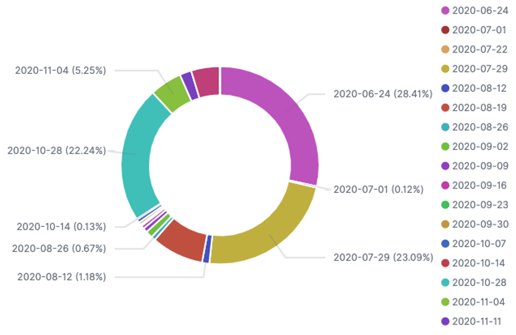
Vulnerability Distribution by First Found
The Vulnerability Distribution by First Found report will show you the vulnerabilities by the date they were first discovered.
In AMP, go to the Log Search screen.
Click on Visualizations.
Click the Create new visualization button.
In the New Visualization pop up, select the Pie Chart visualization option.
Choose a source.
In sources select <PARTNER_ACCT_ID>_<CUSTOMER_ACCT>_customer.
Partner accountId may be 1 or another number. Select the source matching the customer account number in the top right corner of the AMP page or listed on the Account page followed by "_customer".
Log Search will refresh to display the query screen. From here, the visualization can be configured.
One filter will be applied to this visualization:
Click on Add filter
Set the filter up as seen below. You will have to manually type in "ecs-1.5.0-vulnerability in the Value field and click Save
Under metrics this should already be set to Y-axis Count. No change is needed.
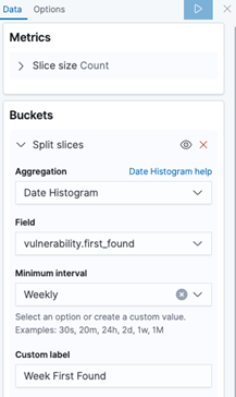
One bucket is needed to configure this visualization. Under Buckets, click the Add button, making sure to select Split Slices.
In the Aggregation drop down, select Date Histogram.
In the Field box, enter "vulnerability.first_found" or search for it.
Set the value in the Minimum interval box to Weekly
A custom label of Week First Found can be added
Properly configured, the bucket configuration will look like the screenshot below:
When the bucket is configured, click the Apply Changes button.
Set the date range for the visualization.
If the range encompasses more than one report, an additional filter with the report id can be added to narrow down the results if desired.
Save the visualization by clicking Save in the top left of the screen.
Users can view previous visualizations by clicking Visualizations and selecting the desired visualization from the list.
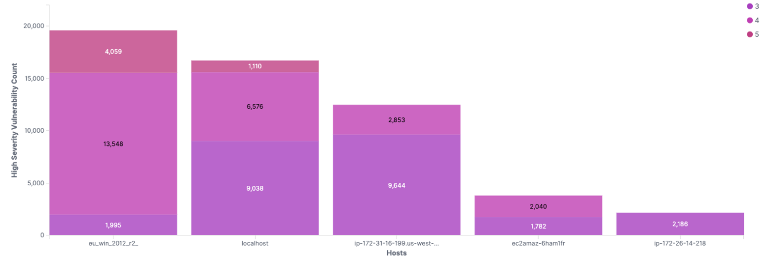
Top 5 Hosts by Count of High Severity Vulnerabilities
The Top 5 Hosts by Count of High Severity Vulnerabilities report will show you the top 5 hosts by count of high severity vulnerabilities
In AMP, go to the Log Search screen.
Click on Visualizations.
Click the Create new visualization button.
In the New Visualization pop up, select the Vertical Bar visualization option.
Choose a source
In sources select <PARTNER_ACCT_ID>_<CUSTOMER_ACCT>_customer.
Partner accountId may be 1 or another number. Select the source matching the account number in the top right corner of the AMP page or listed on the Account page followed by "_customer".
Log Search will refresh to display the query screen. From here, the visualization can be configured.
Two filters will be applied to this visualization:
Click on Add filter
Set the filter up as seen below.
Set the filter up as seen below. You will have to manually type in "ecs-1.5.0-vulnerability in the Value field and click Save
Under metrics this should already be set to Y-axis Count. No change is needed.
Two buckets are needed to configure this visualization.
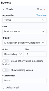
Under Buckets, click the Add button and select X-Axis
In the Aggregation drop down, select Terms.
In the Field box, enter "host.hostname" or search for it.
Order by, Order and Size should all remain with their default values. Properly configured, the first bucket configuration will look like the screenshot below:
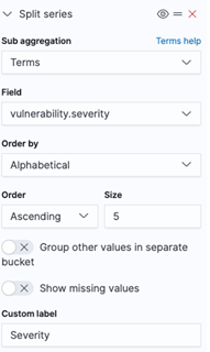
For the second bucket, click the Add button
Select Split Series and In the Aggregation drop down, select Terms.
In the Field box, enter "vulnerability.severity" or search for it.
Order by = Alphabetical, Order and Size should all remain with their default values. A custom label of Severity can be added.
Properly configured, the second bucket configuration will look like the screenshot below:
When the buckets are configured, click the Apply Changes button.
Set the date range for the visualization.
If the range encompasses more than one report, an additional filter with the report id can be added to narrow down the results if desired.
Save the visualization by clicking Save in the top left of the screen.
Users can view previous visualizations by clicking Visualizations and selecting the desired visualization from the list.
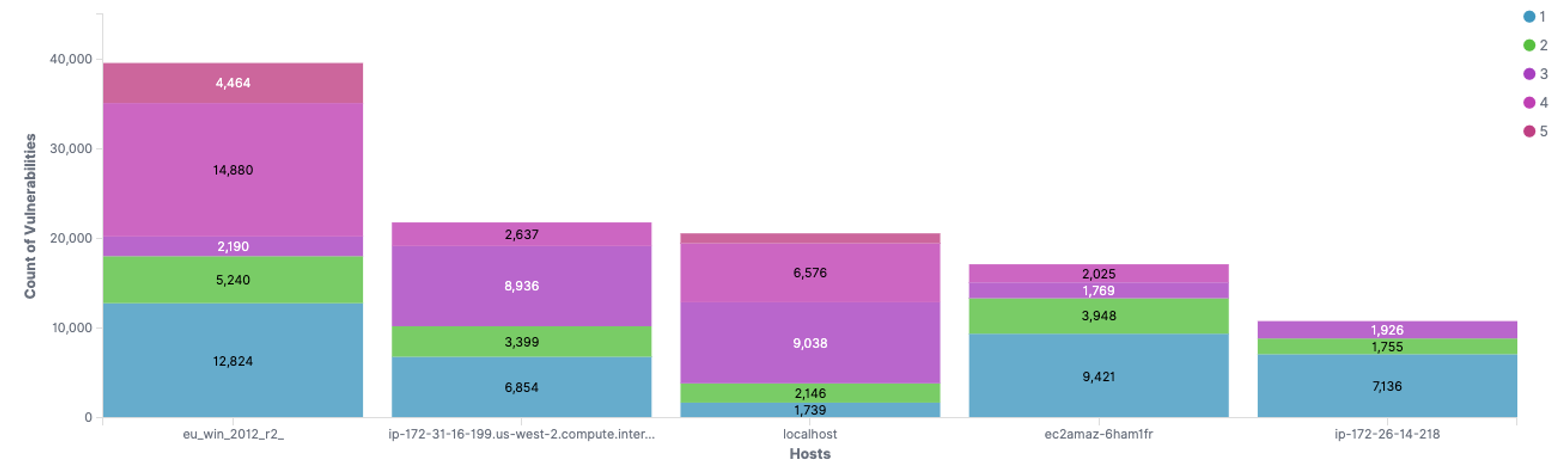
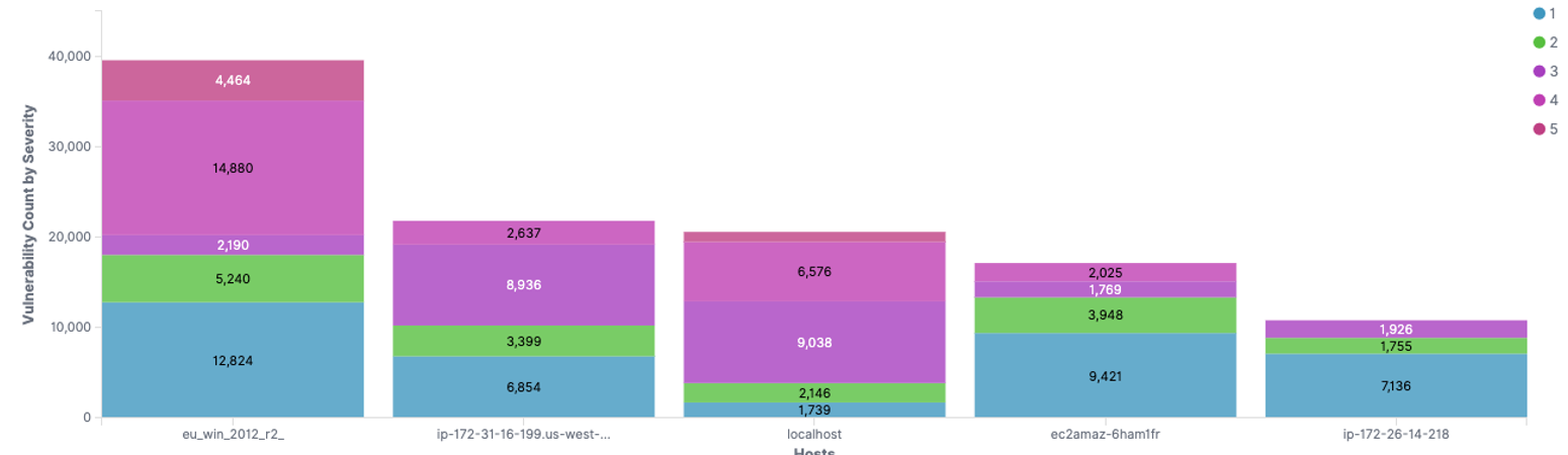
Top 5 Hosts by Count of Vulnerabilities
The Top 5 Hosts by Count of Vulnerabilities report will show you the top 5 hosts by count of total vulnerabilities
In AMP, go to the Log Search screen.
Click on Visualizations.
Click the Create new visualization button.
In the New Visualization pop up, select the Vertical Bar visualization option.
Choose a source
In sources select <PARTNER_ACCT_ID>_<CUSTOMER_ACCT>_customer.
Partner accountId may be 1 or another number. Select the source matching the account number in the top right corner of the AMP page or listed on the Account page followed by "_customer".
Log Search will refresh to display the query screen. From here, the visualization can be configured.
Three filters will be applied to this visualization:
Click on Add filter
Set the first filter up as seen below.
Set the second filter up as seen below
Set the last filter up as seen below. You will have to manually type in "ecs-1.5.0-vulnerability in the Value field and click Save
Under metrics this should already be set to Y-axis Count. No change is needed.
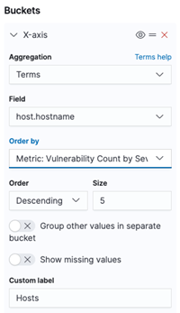
Two buckets are needed to configure this visualization.
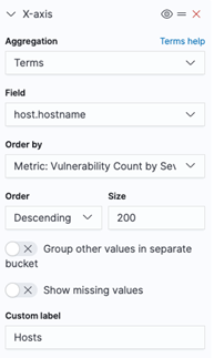
Under Buckets, click the Add button and select X-Axis
In the Aggregation drop down, select Terms.
In the Field box, enter "host.hostname" or search for it.
Order by = Metric: Vulnerability Count by Severity
Order = Descending
Size can vary but for this example it is set to 200
A custom lable of Hosts can be added
Properly configured, the first bucket configuration will look like the screenshot below:
For the second bucket, click the Add button
Select Split Series and In the Aggregation drop down, select Terms.
In the Field box, enter "vulnerability.severity" or search for it.
Order by = Alphabetical, Order and Size should all remain with their default values. A custom label of Severity can be added.
Properly configured, the second bucket configuration will look like the screenshot below:

When the buckets are configured, click the Apply Changes button.
Set the date range for the visualization.
If the range encompasses more than one report, an additional filter with the report id can be added to narrow down the results if desired.
Save the visualization by clicking Save in the top left of the screen.
Users can view previous visualizations by clicking Visualizations and selecting the desired visualization from the list.
Top 5 Hosts by Count of Net New Vulnerabilities
The Top 5 Hosts by Count of Net New Vulnerabilities report will show you the top 5 hosts by count of net new vulnerabilities
Click on Visualizations.
Click the Create new visualization button.
In the New Visualization pop up, select the Vertical Bar visualization option.
Choose a source
In sources select <PARTNER_ACCT_ID>_<CUSTOMER_ACCT>_customer.
Partner accountId may be 1 or another number. Select the source matching the account number in the top right corner of the AMP page or listed on the Account page followed by "_customer".
Log Search will refresh to display the query screen. From here, the visualization can be configured.
Two filters will be applied to this visualization:
Click on Add filter
Set the first filter up as seen below. You will have to manually type in "ecs-1.5.0-vulnerability in the Value field and click Save
Set the second filter up as seen below
Under metrics this should already be set to Y-axis Count. No change is needed.
Two buckets are needed to configure this visualization.
Under Buckets, click the Add button and select X-Axis
In the Aggregation drop down, select Terms.
In the Field box, enter "host.hostname" or search for it.
Order by, Order and Size should all remain with their default values. Properly configured, the first bucket configuration will look like the screenshot below:
For the second bucket, click the Add button
Select Split Series and In the Aggregation drop down, select Terms.
In the Field box, enter "vulnerability.severity" or search for it.
Order by should be set to Alphabetical, Order and Size can remain with their default values. A custom label of Severity can be added. Properly configured, the second bucket configuration will look like the screenshot below:

When the buckets are configured, click the Apply Changes button.
Set the date range for the visualization.
If the range encompasses more than one report, an additional filter with the report id can be added to narrow down the results if desired.
Save the visualization by clicking Save in the top left of the screen.
Users can view previous visualizations by clicking Visualizations and selecting the desired visualization from the list.
Vulnerabilities Sorted from First to Last Discovered
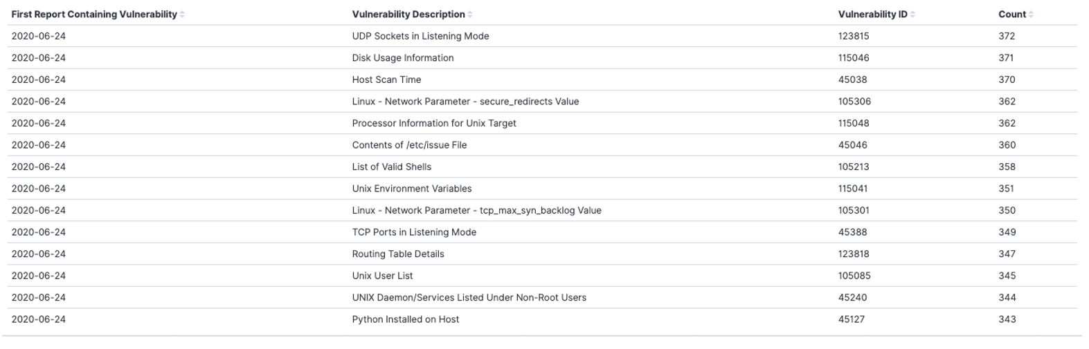
The Vulnerabilities Sorted From First to Last Discovered report will show you a data table of all vulnerabilities sorted from first to last by discovered date
In AMP, go to the Log Search screen.
Click on Visualizations.
Click the Create new visualization button.
In the New Visualization pop up, select the Data Table visualization option.
Choose a source.
In sources select <PARTNER_ACCT_ID>_<CUSTOMER_ACCT>_customer.
Partner accountId may be 1 or another number. Select the source matching the account number in the top right corner of the AMP page or listed on the Account page followed by "_customer".
Log Search will refresh to display the query screen. From here, the visualization can be configured.
One filter will be applied to this visualization:
Click on Add filter
Set the filter up as seen below. You will have to manually type in "ecs-1.5.0-vulnerability in the Value field and click Save

Under metrics this should already be set to Y-axis Count. No change is needed.
3 buckets are needed to configure this visualization.
Bucket configuration for Bucket 1
Under Buckets, click the Add button, and select Split Rows.
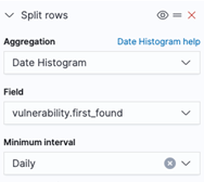
In the Aggregation drop down, select Date Histogram.
In the Field box, enter "vulnerability.first_found" or search for it.
In the Minimum Interval box, select Daily
A custom label of First Report Containing Vulnerability can be set
Properly configured, the first bucket configuration will look like the screenshot below:
Bucket configuration for Bucket 2
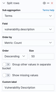
Under Buckets, click the Add button, and select Split rows.
In the Aggregation drop down, select Terms.
In the Field box, enter "vulnerability.description" or search for it.
Order by, Order should remain with their default values.
Size can vary, but for this example it is set to 50
A custom label of Vulnerability Description can be set
Properly configured, the second bucket configuration will look like the screenshot below:
Bucket configuration for Bucket 3
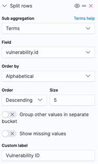
Under Buckets, click the Add button, and select Split rows.
In the Aggregation drop down, select Terms.
In the Field box, enter "vulnerability.id" or search for it.
Order by = Alphabetical, Order and Size should all remain with their default values.
Properly configured, the third bucket configuration will look like the screenshot below:
When the buckets are configured, click the Apply Changes button.
Set the date range for the visualization.
If the range encompasses more than one report, an additional filter with the report id can be added to narrow down the results if desired.
Save the visualization by clicking Save in the top left of the screen.
Users can view previous visualizations by clicking Visualizations and selecting the desired visualization from the list.
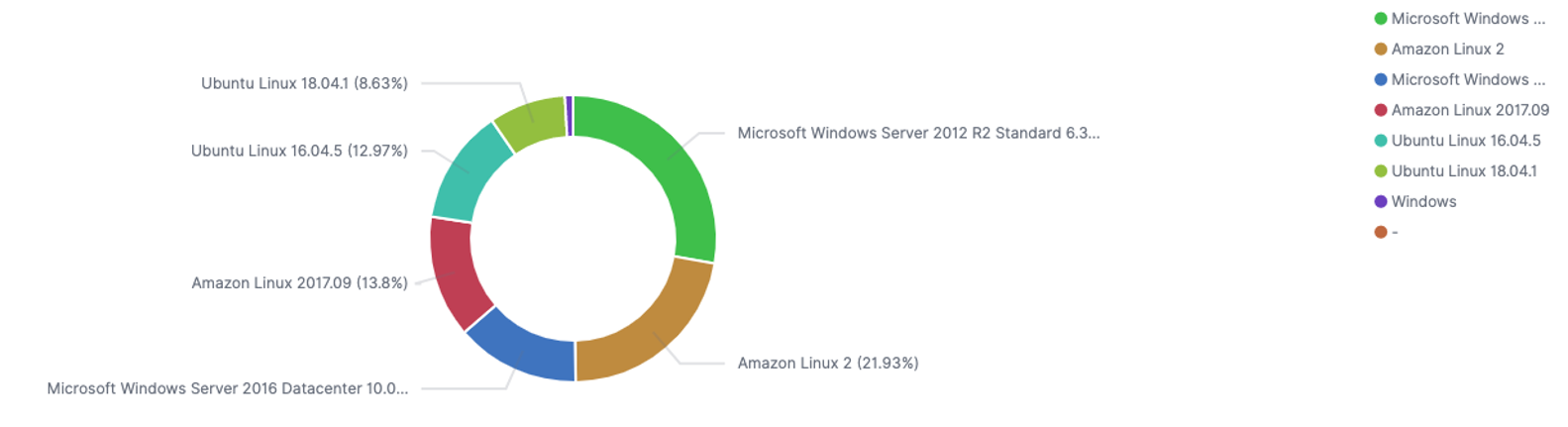
Vulnerability Distribution by OS
The Vulnerability Distribution by OS report will show you the vulnerabilities by Operating System type
In AMP, go to the Log Search screen.
Click on Visualizations.
Click the Create new visualization button.
In the New Visualization pop up, select the Pie Chart visualization option.
Choose a source.
In sources select <PARTNER_ACCT_ID>_<CUSTOMER_ACCT>_customer.
Partner accountId may be 1 or another number. Select the source matching the account number in the top right corner of the AMP page or listed on the Account page followed by "_customer".
Log Search will refresh to display the query screen. From here, the visualization can be configured.
One filter will be applied to this visualization:
Click on Add filter
Set the filter up as seen below. You will have to manually type in "ecs-1.5.0-vulnerability in the Value field and click Save
Under metrics this should already be set to Y-axis Count. No change is needed.
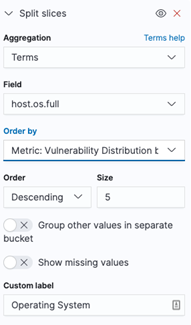
One bucket is needed to configure this visualization. Under Buckets, click the Add button, making sure to select Split Slices.
In the Aggregation drop down, select Terms.
In the Field box, enter "host.os.full" or search for it.
Order by, Order and Size should all remain with their default values.
A custom label of Operating System can be set
Properly configured, the bucket configuration will look like the screenshot below:
When the bucket is configured, click the Apply Changes button.
Set the date range for the visualization.
If the range encompasses more than one report, an additional filter with the report id can be added to narrow down the results if desired.
Save the visualization by clicking Save in the top left of the screen.
Users can view previous visualizations by clicking Visualizations and selecting the desired visualization from the list.
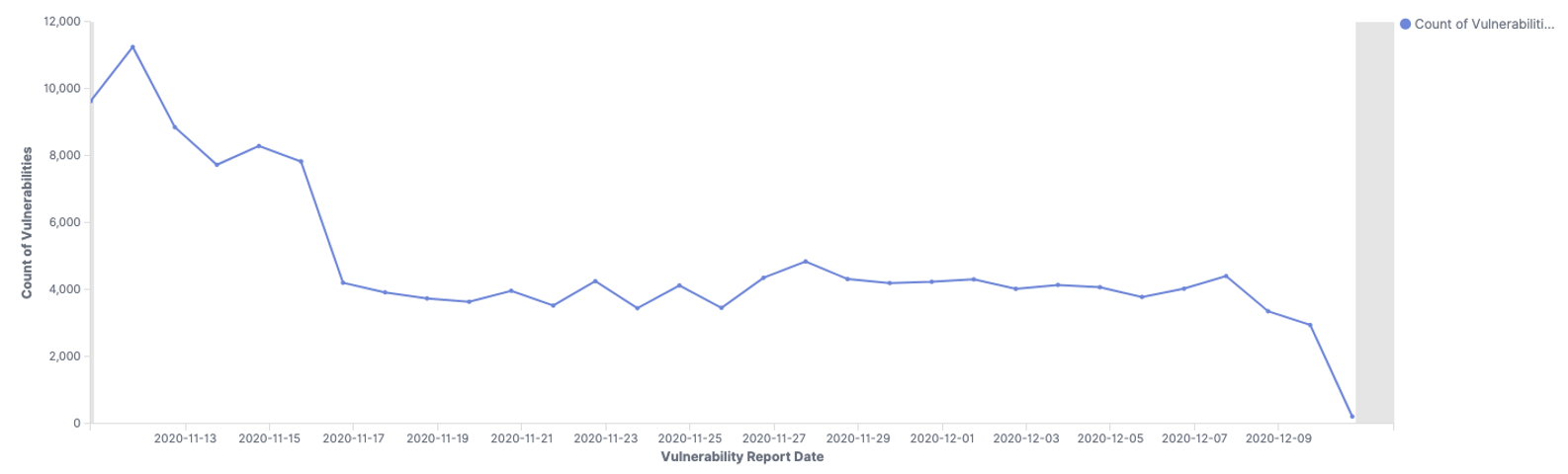
Count of Vulnerabilities by Report Date
The Count of Vulnerabilities By Report Date report will show you a line graph of vulnerability count by report date
In AMP, go to the Log Search screen.
Click on Visualizations.
Click the Create new visualization button.
In the New Visualization pop up, select the Line visualization option.
Choose a source.
In sources select <PARTNER_ACCT_ID>_<CUSTOMER_ACCT>_customer.
Partner accountId may be 1 or another number. Select the source matching the account number in the top right corner of the AMP page or listed on the Account page followed by "_customer".
Log Search will refresh to display the query screen. From here, the visualization can be configured.
One filter will be applied to this visualization:
Click on Add filter
Set the filter up as seen below. You will have to manually type in "ecs-1.5.0-vulnerability in the Value field and click Save

Under metrics this should already be set to Y-axis Count. No change is needed.
One bucket is needed to configure this visualization
Under Buckets, click the Add button and select X-Axis
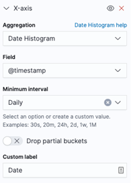
In the Aggregation drop down, select Date Histogram.
In the Field box, enter "@timestamp" or search for it.
In the Minimum Interval box, select Daily
A custom label of Vulnerability Report Date can be set
Properly configured, the bucket configuration will look like the screenshot below:

When the bucket is configured, click the Apply Changes button.
Set the date range for the visualization.
If the range encompasses more than one report, an additional filter with the report id can be added to narrow down the results if desired.
Save the visualization by clicking Save in the top left of the screen.
Users can view previous visualizations by clicking Visualizations and selecting the desired visualization from the list.
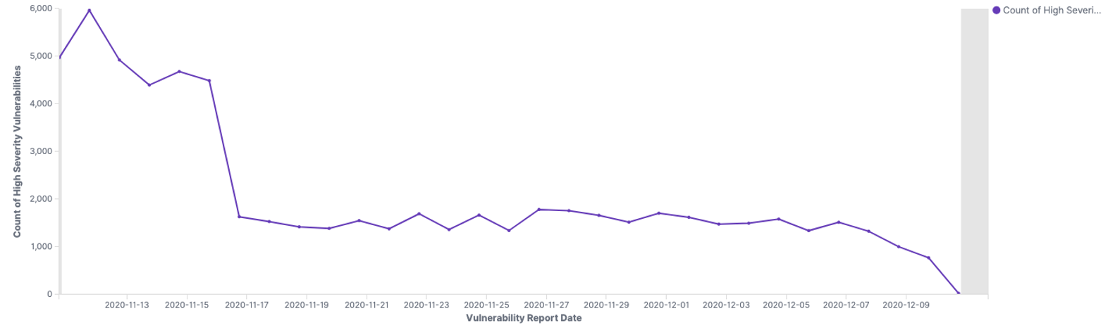
Count of High Severity Vulnerabilities by Report Date
The Count of High Severity Vulnerabilities By Report Date report will show you a line graph of the count of high severity vulnerabilities by date
In AMP, go to the Log Search screen.
Click on Visualizations.
Click the Create new visualization button.
In the New Visualization pop up, select the Line visualization option.
Choose a source.
In sources select <PARTNER_ACCT_ID>_<CUSTOMER_ACCT>_customer.
Partner accountId may be 1 or another number. Select the source matching the account number in the top right corner of the AMP page or listed on the Account page followed by "_customer".
Log Search will refresh to display the query screen. From here, the visualization can be configured.
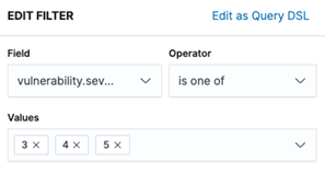
Two filters will be applied to this visualization:
Click on Add filter
Set the first filter up as seen below. You will have to manually type in "ecs-1.5.0-vulnerability in the Value field and click Save

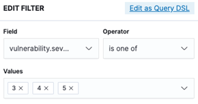
Set the second filter up as seen below. You will have to manually type in 3, 4 and 5. These are the severity levels
Under metrics this should already be set to Y-axis Count. No change is needed.
One bucket is needed to configure this visualization
Under Buckets, click the Add button and select X-Axis
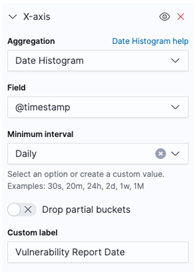
In the Aggregation drop down, select Date Histogram.
In the Field box, enter "@timestamp" or search for it.
In the Minimum Interval box, select Daily
A custom label of Vulnerability Report Date can be set
Properly configured, the bucket configuration will look like the screenshot below:
When the bucket is configured, click the Apply Changes button.
Set the date range for the visualization.
If the range encompasses more than one report, an additional filter with the report id can be added to narrow down the results if desired.
Save the visualization by clicking Save in the top left of the screen.
Users can view previous visualizations by clicking Visualizations and selecting the desired visualization from the list.
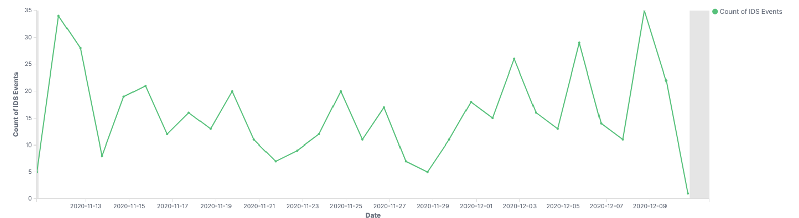
Count of IDS Events
The Count of IDS Events report will show you a line graph count of IDS events
In AMP, go to the Log Search screen.
Click on Visualizations.
Click the Create new visualization button.
In the New Visualization pop up, select the Line visualization option.
Choose a source.
In sources select <PARTNER_ACCT_ID>_<CUSTOMER_ACCT>_customer.
Partner accountId may be 1 or another number. Select the source matching the account number in the top right corner of the AMP page or listed on the Account page followed by "_customer".
Log Search will refresh to display the query screen. From here, the visualization can be configured.
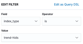
One filter will be applied to this visualization:
Click on Add filter
Set the filter up as seen below. You will have to manually type in "trend-hids" in the Value field and click Save

Under metrics this should already be set to Y-axis Count. No change is needed.
One bucket is needed to configure this visualization
Under Buckets, click the Add button and select X-Axis
In the Aggregation drop down, select Date Histogram.
In the Field box, enter "@timestamp" or search for it.
In the Minimum Interval box, select Daily
A custom label of Date can be set
Properly configured, the bucket configuration will look like the screenshot below:
When the bucket is configured, click the Apply Changes button.
Set the date range for the visualization.
If the range encompasses more than one report, an additional filter with the report id can be added to narrow down the results if desired.
Save the visualization by clicking Save in the top left of the screen.
Users can view previous visualizations by clicking Visualizations and selecting the desired visualization from the list.
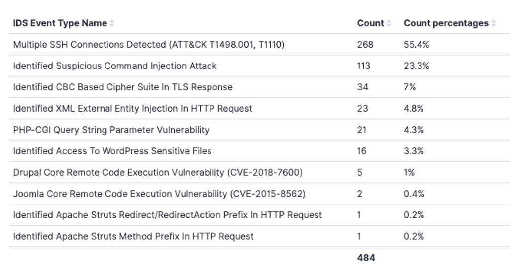
Top 10 IDS Event Types
The Top 10 IDS Event Types report will show you a data table of the Top 10 types of IDS event
In AMP, go to the Log Search screen.
Click on Visualizations.
Click the Create new visualization button.
In the New Visualization pop up, select the Line visualization option.
Choose a source.
In sources select <PARTNER_ACCT_ID>_<CUSTOMER_ACCT>_customer.
Partner accountId may be 1 or another number. Select the source matching the account number in the top right corner of the AMP page or listed on the Account page followed by "_customer".
Log Search will refresh to display the query screen. From here, the visualization can be configured.
One filter will be applied to this visualization:
Click on Add filter
Set the filter up as seen below. You will have to manually type in "trend-hids" in the Value field and click Save
Under metrics this should already be set to Metric Count. No change is needed.
One bucket is needed to configure this visualization
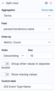
Under Buckets, click the Add button and select Split rows
In the Aggregation drop down, select Terms.
In the Field box, enter "parsed.trendmicro.name" or search for it.
Order by = Metric: Count, Order = Descending, Size = 10
A custom label of IDS Event Type Name can be set
Properly configured, the bucket configuration will look like the screenshot below:
When the bucket is configured, click the Apply Changes button.
Set the date range for the visualization.
If the range encompasses more than one report, an additional filter with the report id can be added to narrow down the results if desired.
Save the visualization by clicking Save in the top left of the screen.
Users can view previous visualizations by clicking Visualizations and selecting the desired visualization from the list.
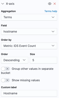
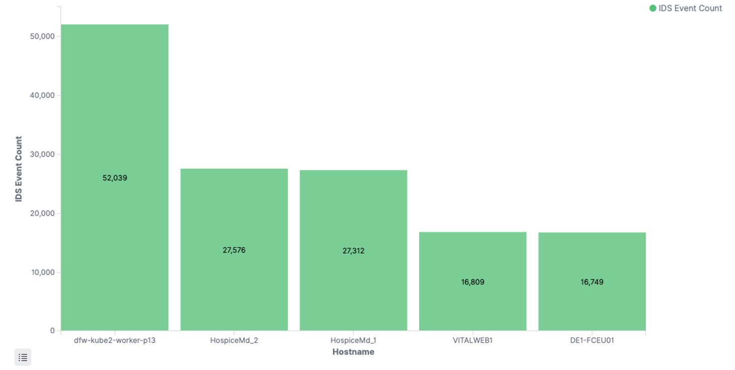
Top 5 Systems by IDS Event Count
The Top 5 Systems By IDS Event Count report will show you a vertical bar graph of the Top 5 systems by the total count of IDS events
In AMP, go to the Log Search screen.
Click on Visualizations.
Click the Create new visualization button.
In the New Visualization pop up, select the Vertical Bar visualization option.
Choose a source.
In sources select <PARTNER_ACCT_ID>_<CUSTOMER_ACCT>_customer.
Partner accountId may be 1 or another number. Select the source matching the account number in the top right corner of the AMP page or listed on the Account page followed by "_customer".
Log Search will refresh to display the query screen. From here, the visualization can be configured.
One filter will be applied to this visualization:
Click on Add filter
Set the filter up as seen below. You will have to manually type in "trend-hids" in the Value field and click Save

Under metrics this should already be set to Y-Axis Count. No change is needed.
One bucket is needed to configure this visualization
Under Buckets, click the Add button and select X-Axis
In the Aggregation drop down, select Terms.
In the Field box, enter "hostname" or search for it.
Order by, Order, & Size leave at default
A custom label of Hostname can be set
Properly configured, the bucket configuration will look like the screenshot below:
When the bucket is configured, click the Apply Changes button.
Set the date range for the visualization.
If the range encompasses more than one report, an additional filter with the report id can be added to narrow down the results if desired.
Save the visualization by clicking Save in the top left of the screen.
Users can view previous visualizations by clicking Visualizations and selecting the desired visualization from the list.
Security - IPRM Location
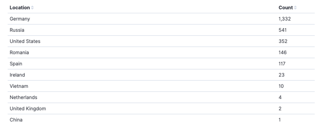
The Security — IPRM Location report will show you a data table with geographic country locations and security event counts coming from each country
In AMP, go to the Log Search screen.
Click on Visualizations.
Click the Create new visualization button.
In the New Visualization pop up, select the Data Table visualization option.
Choose a source.
In sources select <PARTNER_ACCT_ID>_<CUSTOMER_ACCT>_customer.
Partner accountId may be 1 or another number. Select the source matching the account number in the top right corner of the AMP page or listed on the Account page followed by "_customer".
Log Search will refresh to display the query screen. From here, the visualization can be configured.
Three filters will be applied to this visualization:
Click on Add filter
Set the first filter up as seen below
Set the second filter up as seen below
Set the third filter up as seen below
Under metrics this should already be set to Metric Count. No change is needed.
One bucket is needed to configure this visualization.
Bucket configuration
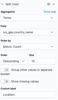
Under Buckets, click the Add button, and select Split Rows.
In the Aggregation drop down, select Terms.
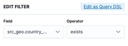
In the Field box, enter "src_geo.country_name" or search for it.
Order = Descending and Size =10 (can vary depending on how long you want the list)
A custom label of Location can be added
Properly configured, the bucket configuration will look like the screenshot below:
When the buckets are configured, click the Apply Changes button.
Set the date range for the visualization.
If the range encompasses more than one report, an additional filter with the report id can be added to narrow down the results if desired.
Save the visualization by clicking Save in the top left of the screen.
Users can view previous visualizations by clicking Visualizations and selecting the desired visualization from the list.
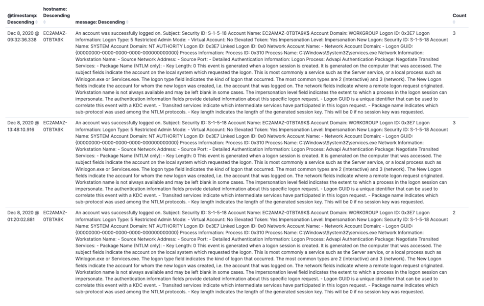
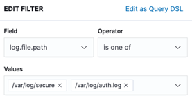
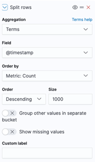
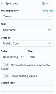
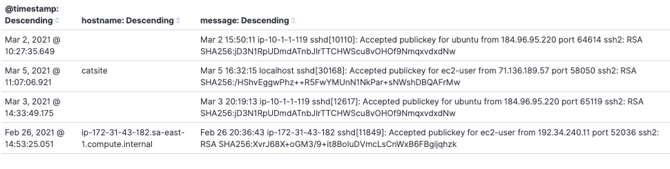
Windows Successful Logins
The Windows Successful Logins report will show you a data table listing hostname, timestamp and the message log for successful logins on Windows systems
In AMP, go to the Log Search screen.
Click on Visualizations.
Click the Create new visualization button.
In the New Visualization pop up, select the Data Table visualization option.
Choose a source.
In sources select <PARTNER_ACCT_ID>_<CUSTOMER_ACCT>_customer.
Partner accountId may be 1 or another number. Select the source matching the account number in the top right corner of the AMP page or listed on the Account page followed by "_customer".
Log Search will refresh to display the query screen. From here, the visualization can be configured.
One filter will be applied to this visualization:
Click on Add filter
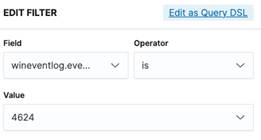
Set the first filter up as seen below. The value in Field is wineventlog.event_id
Under metrics this should already be set to Metric Count. No change is needed.
Three buckets are needed to configure this visualization.
Bucket 1 configuration
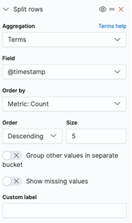
Under Buckets, click the Add button, and select Split Rows.
In the Aggregation drop down, select Terms.
In the Field box, enter "@timestamp" or search for it.
Order = Descending and Size =5 (can vary depending on how long you want the list)
Properly configured, the first bucket configuration will look like the screenshot below:
Bucket 2 configuration
Under Buckets, click the Add button, and select Split Rows.
In the Aggregation drop down, select Terms.
In the Field box, enter "hostname" or search for it.
Order = Descending and Size =1000 (can vary depending on how long you want the list)
Properly configured, the second bucket configuration will look like the screenshot below:

Bucket 3 configuration
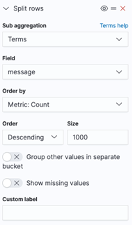
Under Buckets, click the Add button, and select Split Rows.
In the Aggregation drop down, select Terms.
In the Field box, enter "message" or search for it.
Order = Descending and Size =1000 (can vary depending on how long you want the list)
Properly configured, the third bucket configuration will look like the screenshot below:
When the buckets are configured, click the Apply Changes button.
Set the date range for the visualization.
If the range encompasses more than one report, an additional filter with the report id can be added to narrow down the results if desired.
Save the visualization by clicking Save in the top left of the screen.
Users can view previous visualizations by clicking Visualizations and selecting the desired visualization from the list.
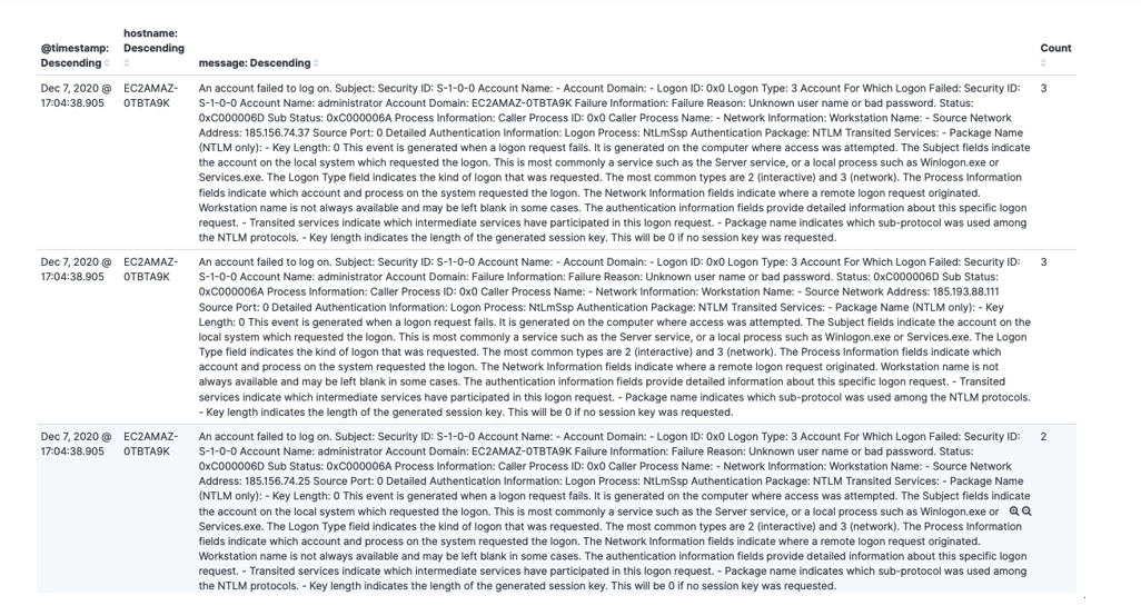
Windows Failed Logins
The Windows Failed Logins report will show you a data table listing hostname, timestamp and the message log for failed logins on Windows systems
In AMP, go to the Log Search screen.
Click on Visualizations.
Click the Create new visualization button.
In the New Visualization pop up, select the Data Table visualization option.
Choose a source.
In sources select <PARTNER_ACCT_ID>_<CUSTOMER_ACCT>_customer.
Partner accountId may be 1 or another number. Select the source matching the account number in the top right corner of the AMP page or listed on the Account page followed by "_customer".
Log Search will refresh to display the query screen. From here, the visualization can be configured.
One filter will be applied to this visualization:
Click on Add filter
Set the first filter up as seen below. The value in Field is wineventlog.event_id
Under metrics this should already be set to Metric Count. No change is needed.
Three buckets are needed to configure this visualization.
Bucket 1 configuration
Under Buckets, click the Add button, and select Split Rows.
In the Aggregation drop down, select Terms.
In the Field box, enter "@timestamp" or search for it.
Order = Descending and Size =5 (can vary depending on how long you want the list)
Properly configured, the first bucket configuration will look like the screenshot below:
Bucket 2 configuration
Under Buckets, click the Add button, and select Split Rows.
In the Aggregation drop down, select Terms.
In the Field box, enter "hostname" or search for it.
Order = Descending and Size =1000 (can vary depending on how long you want the list)
Properly configured, the second bucket configuration will look like the screenshot below:
Bucket 3 configuration
Under Buckets, click the Add button, and select Split Rows.
In the Aggregation drop down, select Terms.
In the Field box, enter "message" or search for it.
Order = Descending and Size =1000 (can vary depending on how long you want the list)
Properly configured, the third bucket configuration will look like the screenshot below:
When the buckets are configured, click the Apply Changes button.
Set the date range for the visualization.
If the range encompasses more than one report, an additional filter with the report id can be added to narrow down the results if desired.
Save the visualization by clicking Save in the top left of the screen.
Users can view previous visualizations by clicking Visualizations and selecting the desired visualization from the list.
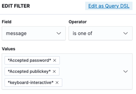
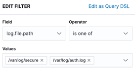
Linux Successful Logins
The Linux Successful Logins report will show you a data table listing hostname, timestamp and the message log for successful logins on Linux systems
In AMP, go to the Log Search screen.
Click on Visualizations.
Click the Create new visualization button.
In the New Visualization pop up, select the Data Table visualization option.
Choose a source.
In sources select <PARTNER_ACCT_ID>_<CUSTOMER_ACCT>_customer.
Partner accountId may be 1 or another number. Select the source matching the account number in the top right corner of the AMP page or listed on the Account page followed by "_customer".
Log Search will refresh to display the query screen. From here, the visualization can be configured.
Two filters will be applied to this visualization:
Click on Add Filter
Set the first filter up as seen below
Set the second filter up as seen below
Under metrics this should already be set to Metric Count. No change is needed.
Three buckets are needed to configure this visualization.
Bucket 1 configuration
Under Buckets, click the Add button, and select Split Rows.
In the Aggregation drop down, select Terms.
In the Field box, enter "@timestamp" or search for it.
Order = Descending and Size =1000 (can vary depending on how long you want the list)
Properly configured, the first bucket configuration will look like the screenshot below:
Bucket 2 configuration
Under Buckets, click the Add button, and select Split Rows.
In the Aggregation drop down, select Terms.
In the Field box, enter "hostname" or search for it.
Order = Descending and Size =1000 (can vary depending on how long you want the list)
Properly configured, the second bucket configuration will look like the screenshot below:
Bucket 3 configuration
Under Buckets, click the Add button, and select Split Rows.
In the Aggregation drop down, select Terms.
In the Field box, enter "message" or search for it.
Order = Descending and Size =1000 (can vary depending on how long you want the list)
Properly configured, the third bucket configuration will look like the screenshot below:

When the buckets are configured, click the Apply Changes button.
Set the date range for the visualization.
If the range encompasses more than one report, an additional filter with the report id can be added to narrow down the results if desired.
Save the visualization by clicking Save in the top left of the screen.
Users can view previous visualizations by clicking Visualizations and selecting the desired visualization from the list.
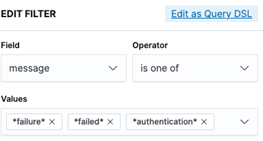
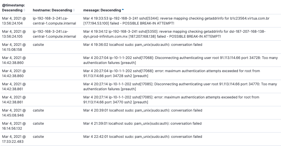
Linux Failed Logins
The Linux Failed Logins report will show you a data table listing hostname, timestamp and the message log for failed logins on Linux systems
In AMP, go to the Log Search screen.
Click on Visualizations.
Click the Create new visualization button.
In the New Visualization pop up, select the Data Table visualization option.
Choose a source.
In sources select <PARTNER_ACCT_ID>_<CUSTOMER_ACCT>_customer.
Partner accountId may be 1 or another number. Select the source matching the account number in the top right corner of the AMP page or listed on the Account page followed by "_customer".
Log Search will refresh to display the query screen. From here, the visualization can be configured.
Two filters will be applied to this visualization:
Click on Add filter
Set the first filter up as seen below
Set the second filter up as seen below
Under metrics this should already be set to Metric Count. No change is needed.
Three buckets are needed to configure this visualization.
Bucket 1 configuration
Under Buckets, click the Add button, and select Split Rows.
In the Aggregation drop down, select Terms.
In the Field box, enter "@timestamp" or search for it.
Order = Descending and Size =1000 (can vary depending on how long you want the list)
Properly configured, the first bucket configuration will look like the screenshot below:

Bucket 2 configuration
Under Buckets, click the Add button, and select Split Rows.
In the Aggregation drop down, select Terms.
In the Field box, enter "hostname" or search for it.
Order = Descending and Size =1000 (can vary depending on how long you want the list)
Properly configured, the second bucket configuration will look like the screenshot below:

Bucket 3 configuration
Under Buckets, click the Add button, and select Split Rows.
In the Aggregation drop down, select Terms.
In the Field box, enter "message" or search for it.
Order = Descending and Size =1000 (can vary depending on how long you want the list)
Properly configured, the third bucket configuration will look like the screenshot below:
When the buckets are configured, click the Apply Changes button.
Set the date range for the visualization.
If the range encompasses more than one report, an additional filter with the report id can be added to narrow down the results if desired.
Save the visualization by clicking Save in the top left of the screen.
Users can view previous visualizations by clicking Visualizations and selecting the desired visualization from the list.
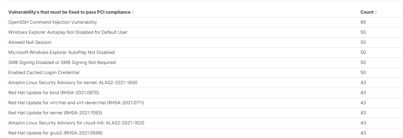
PCI Flagged Vulnerabilities
In AMP, go to the Log Search
Click on Visualizations.
Click the Create new visualization
Select "Create new visualization" and scroll down and select "Data Table"
In sources, select <PARTNER_ACCT_ID>_<CUSTOMER_ACCT>_customer.
Partner account Id may be 1 or another number. Select the source matching the account number in the top right corner of the AMP page or listed on the Account page followed by "_customer".
Log Search will refresh to display the query screen. From here, the visualization can be configured.
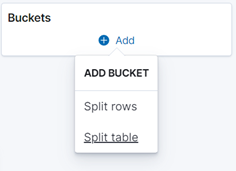
Under "Buckets", select "Add" and then "Split Rows"
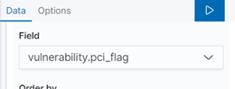
Select "Terms" for the Aggregation, and type in "vulnerability.pci_flag" for the field and hit the blue arrow at the top of the box
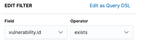
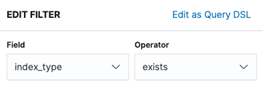
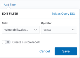
Next, select "+Add filter" , and type "vulnerability.description" for Field, "Exists" as the Operator and hit "Save"
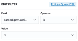
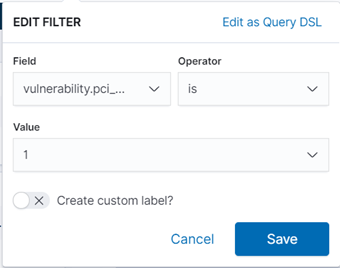
Add another filter by selecting ''+Add filter", and type ''vulnerability.pci_flag" for Field, and "is" for Operator. Type the number "1" in Value and hit "Save"
Make sure to adjust the time if you are not getting any data to populate.
Don't forget to save your Visualization at the top left.
CSPM: Failed by Severity
The CSPM: Failed by Severity visualization is a pie chart that displays failed reports by severity.
In AMP, go to the Log Search screen.
Click on Visualizations.
Click the Create new visualization button.
Select "Create new visualization" and scroll down and select "Pie"
Choose a
In sources select <PARTNER_ACCT_ID>_<CUSTOMER_ACCT>_customer.
Partner account Id may be 1 or another number. Select the source matching the account number in the top right corner of the AMP page or listed on the Account page followed by "_customer".
Log Search will refresh to display the query screen. From here, the visualization can be configured.
Click "Add filter" to filter to the failed report data:
Type ''event.outcome" in Operator is ''is'', and Value is "FAIL". Then hit ''Save"
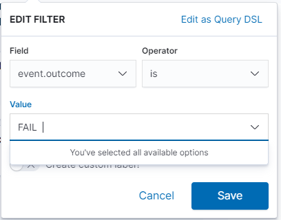
(If you receive an error, change the time field to the last 30 days to expand your search)
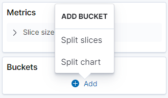
Navigate to Buckets, add bucket and select "Split slices"
Aggregation= Terms, type ''event.severity'' for Field
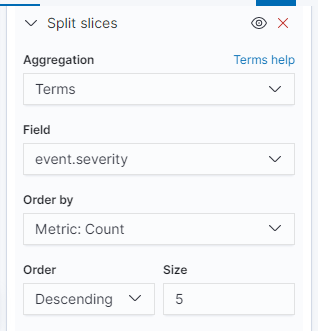
To confirm those changes, click the blue box with a triangle:
Don't forget to save your Visualization at the top left