
The Top failed resources by criticality by ReportId report shows the the top 5 resources by criticality in a pie chart. The inner ring is the criticality, while the outer ring shows the top 5 resources for each of those critcalities.
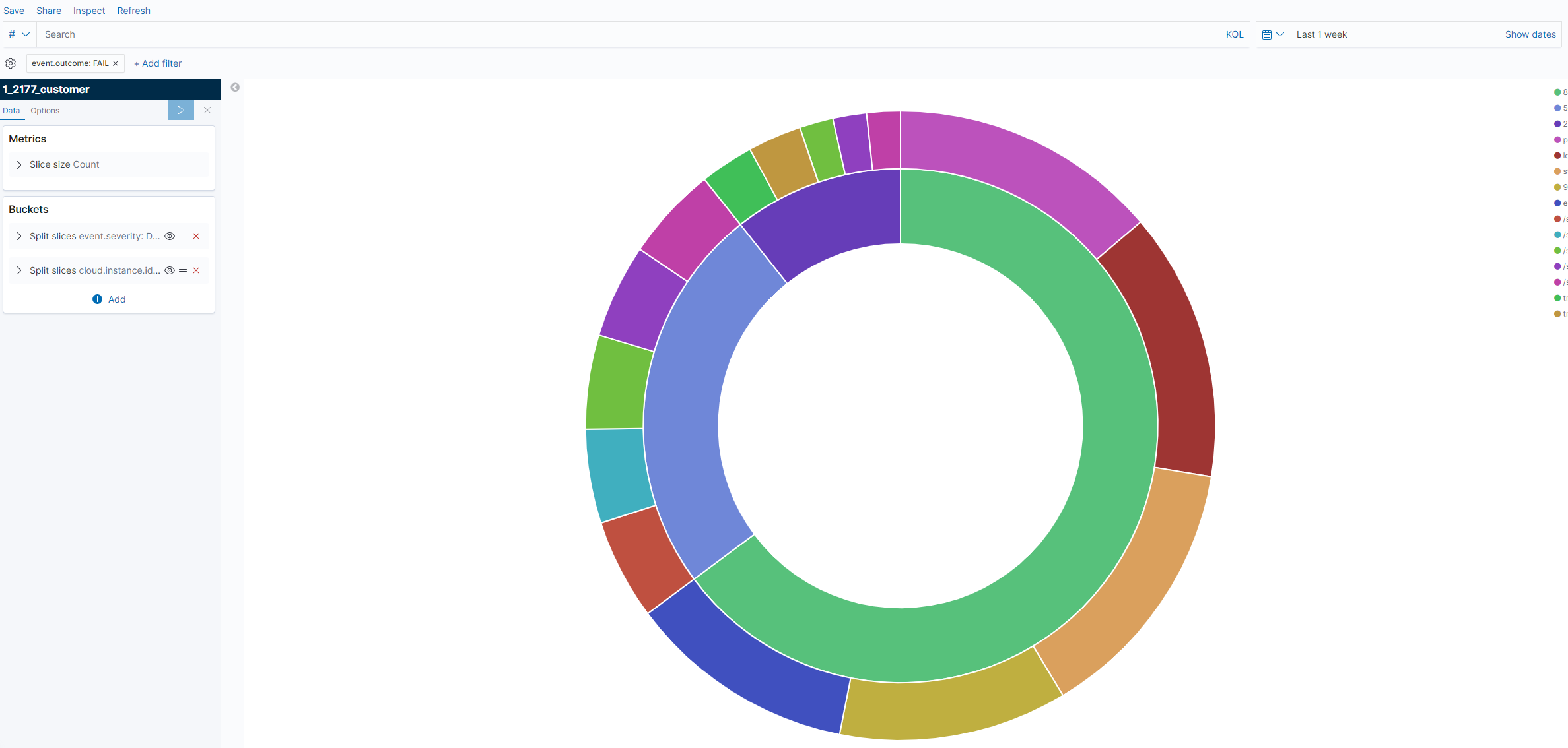
-
In Nexus, go to the Log Search tab located at the Log Search screen under Threat Management.
-
Click on Visualizations.
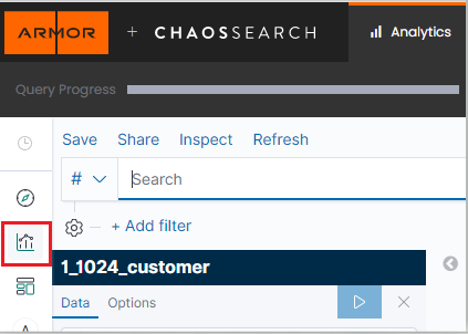
-
Click the Create new visualization button.

-
In the New Visualization pop up, select the Pie Chart visualization option.
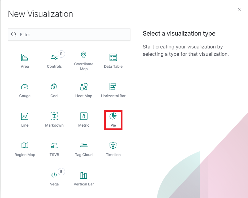
-
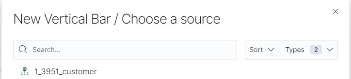
Choose a source.
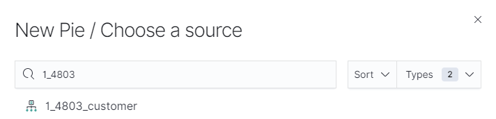
-
In sources select <PARTNER_ACCT_ID>_<CUSTOMER_ACCT>_customer.
-
Partner accountId may be 1 or another number. Select the source matching the account number in the top right corner of the page or listed on the Account page followed by "_customer".
-
-
-
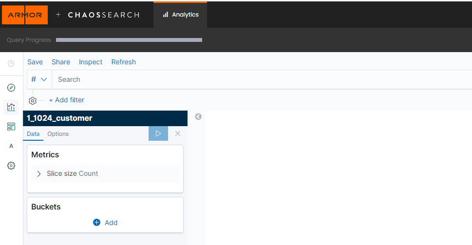
Log Search will refresh to display the query screen. From here, the visualization can be configured.
-
Follow the documentation to add a filter for the reportId before moving to the next step.
-
Under Metrics this should default to Slice size Count. No change is needed.
-
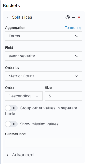
Two buckets are needed to configure this visualization. Under Buckets, click the Add button, making sure to select Split slices.
-
In the Aggregation drop down, select Terms.
-
In the Field box, enter "event.severity" or search for it.
-
Order by, Order and Size should all remain with their default values. Properly configured, the first bucket will look like the screenshot below:
-
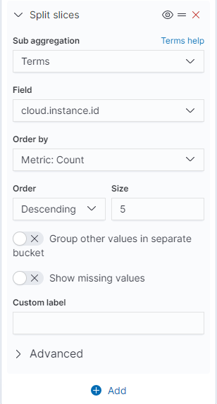
To add the second bucket, click the Add button underneath Buckets, making sure to select Split slices.
-
In the Sub aggregation dropdown, select Terms.
-
In the Field, enter "cloud.instance.id" and select it.
-
Order by, Order and Size will be set to default. Properly configured, the second bucket will look like the screenshot below:
-
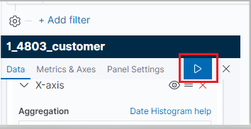
When both buckets are configured, click the Apply Changes button.
-
Set the date range for the visualization.
-
If the range encompasses more than one report, an additional filter with the report id can be added to narrow down the results if desired.

-
-
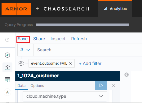
Save the visualization by clicking Save in the top left of the screen.
Users can view previous visualizations by clicking Visualizations and selecting the desired visualization from the list.